
A More Intuitive Enrollment Process
UX Research — UX Design — Rapid Prototyping

If “the journey of a thousand miles begins with a single step”, how do we help prospective bootcamp students take that first (scary) step?
TLDR —
The process of applying to an educational bootcamp (and honestly, any sort of career change) can be a terrifying experience, especially if you’re applying on your own without any outside help. An online bootcamp service reached out to our team, curious why their bootcamp’s self-enrollment portal was underperforming. Students were lost, confused, and dropping out of their funnel — but why? 🤔
In just 6 weeks (consisting of 5 rounds of research + design and 160+ screens), we delivered an evolved enrollment experience and research report to our client, resulting in further business investment in UX research focusing on the holistic student experience.
MY ROLE
Product designer responsible for leading UX research and 5 rounds of iterative design for the self-enrollment experience
TEAM
3 Product Designers @ Robots and Pencils, including 1 with UX research experience (myself)
TimEline
6-week project in spring 2020, including a 2-week period where we performed 5 turns of rapid research and design
The Context
An online bootcamp’s self-enrollment portal proved too confusing and intimidating for potential students to self-enroll.
As online bootcamps evolve into an increasingly more popular way to change careers, the process for enrolling must evolve with the increased demand. To meet this challenge, our client created an online self-enrollment portal that allowed students to apply for a program, take a placement test, and pick a financial plan, all within one app.
This process, while streamlined, was a lot for our visitors to take in. Users were already overwhelmed with the weight of the decision in front of them, and the app was rife with several UX and technical issues that made things worse. Our goal was to evaluate the app’s current state, identify key opportunities for improvement, and address these via several rounds of design and testing.
The Solution
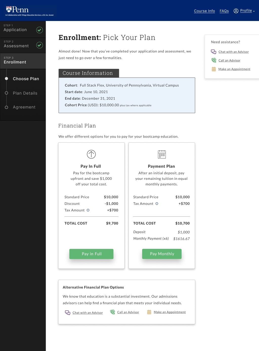
A new self-enrollment portal that prioritized context, consistency, and counseling.
After five iterations of the portal process, we designed an application that gave students better context to where they were at in the process and what to expect next, all the while prioritizing consistent navigation and tone throughout all copy, labels, and microinteractions.
We also focused on ensuring the student has ongoing access to counseling and other help options on demand. Investing in your education can be a big (and scary) decision. As such, prospective students should be able to stop at any time and ask someone for help or clarification.
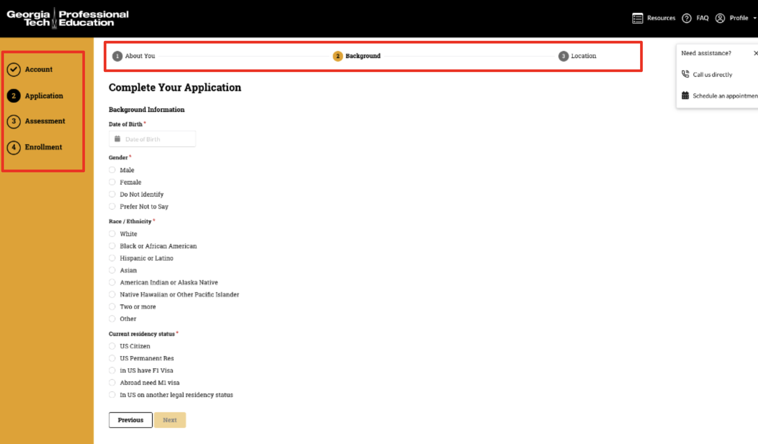
Example Screens


PROCESS
Pain Points
From our initial usability testing on their live portal, we identified several key usability concerns:

1) Poor hierarchy
Poor information hierarchy on the first login screen prevented users from clicking the “Apply Now” call-to-action (CTA). Users skipped straight to the text boxes without reading the associated header labels, and mistakenly tried to sign in.
Once past the landing page, several users commented that second screen was too text-heavy and hard to digest, with one user noting, “I likely won’t read all of that. I like all of the information in that paragraph but would like to see it broken up better.”
2) Competing navigation
The first portal we tested had issues with in-app navigation and making clear where users were in the process. Conflicting navigation bars (both vertical and horizontal) and lack of context clues within the pages left users wondering where they were in the process.

3) Vague copy
Context also impacts how users answer the form field questions — many application questions were open to interpretation and resulted in a range of responses. For example, “providing years of work experience” doesn’t state what type of experience counts. “Rate your computer skills” doesn’t specify which computer skills or what makes you a beginner vs an expert. Users also weren’t sure what this information was being used for, and thus were unsure if their answers could disqualify their application.

4) Confusing help options
The help options available were confusing to users as well as randomly spread out across the page. Folks generally avoided calling directly, and users considered making an appointment with an advisor too cumbersome. Our later designs explored alternative help options within the application.
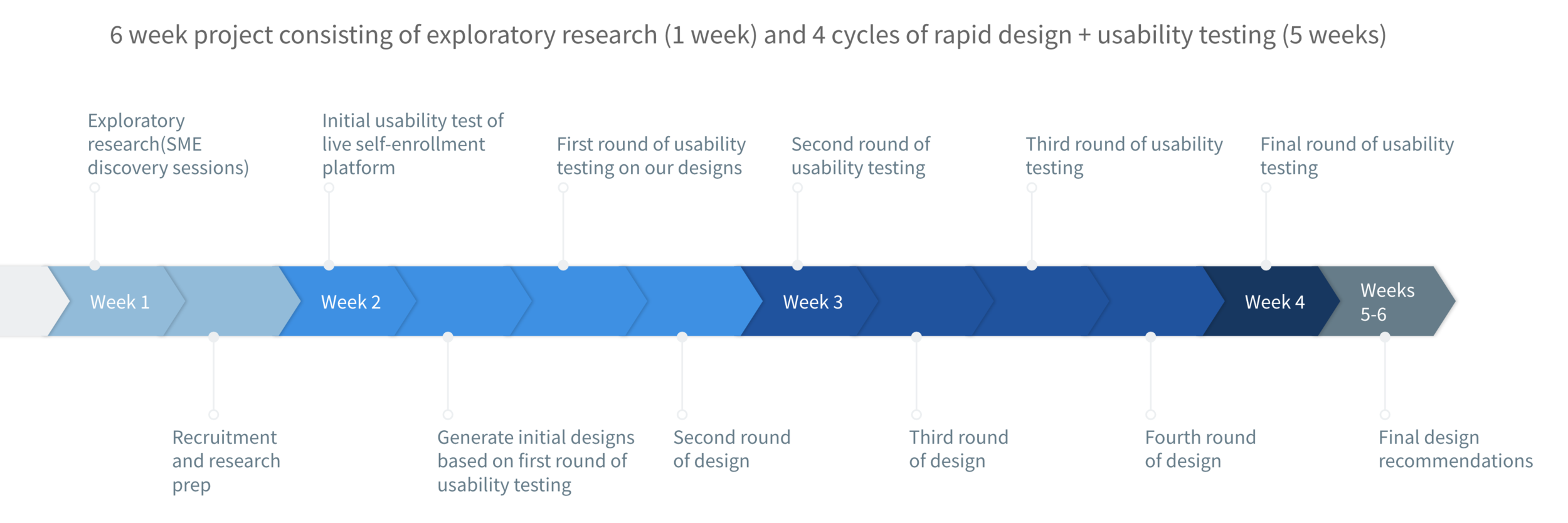
Project Timeline
Methodology
A combination of stakeholder interviews with marketing (n=3) and admissions advisor representatives (n=3) helped us identify areas to focus our attention during testing. After this, our research largely focused on rounds of rapid iterative design followed by usability testing.
Within a week, we performed our first round of remote moderated usability testing on the live self-enrollment portal, watching students go through the portal and pretend as if they were applying themselves. For this round, our team used a combination of Reddit, Facebook, LinkedIn, and Ethnio to recruit potential participants for our first round (n=7).
By sheer coincidence, we managed to recruit a handful of actual former bootcamp participants for testing. We had 5 users who had participated in bootcamps previously from other providers that were happy to compare their bootcamp enrollment experience to our prototype.
Below: Sources of Recruitment [Reddit, facebook, linkedin, ethnio]


Design and Test (4 Rounds)
After the first round of usability testing on the live portal, we had 48 hours to quickly iterate and generate new designs for testing. Using Figma, we created several clickable prototypes that captured the key steps of the self-enrollment process in a way that was straightforward and informative.
Once our design was ready, we’d perform moderated usability testing, quickly synthesize our top findings, and implement changes into the next round of design. From there, the process was rinse and repeat.

Over 160 screens later
After performing five rounds of rapid design and four rounds of usability testing over the course of 2 weeks, our key improvements focused on areas of information architecture, navigation, context, iconography, and copy. We also focused on redesigning the help menu to be more intuitive based on user feedback.
END RESULT
Selected Features
Across each iteration, we would focus on a handful of features to improve upon based on user feedback, including the following:

Landing Page Refresh
As the first page your users land on, this page must be clear and easy to understand.
Previous issues: Poor information hierarchy, wall of text that nobody reads, lack of feedback for password requirements
Improvements: One column approach, combining two screens into one, converting text into scannable icons, direct and local password context

Improved Navigation
Users need to know how far they are in the enrollment process and how much they have left to complete.
Previous issues: Unclear which navigation menu to follow, unapparent if navigation bar was a clickable component
Improvements: One condensed side panel navigation bar that users could click to explore, knowing where they were in the process

Clearer Copy
Throughout the application, there were certain questions that left users guessing, like estimating years of work experience. Since bootcamps are typically for transitional career paths, users weren’t sure if their previous unrelated work experience counted.
Previous issues: Confusing questions, unclear what school was using data for, lack of scaffolding or feedback for various answers
Improvements: Provided clearer feedback to users about how to fill out the necessary forms with info tooltips and helper text, as well as information about how their data will be used.

Streamlined Help Options
Per Nielsen’s design heuristic #10, users should always have straightforward access to clear help and documentation.
Previous issues: Too many help options, options spread out across the page in too many places (sticky virtual assistant that felt out of place)
Improvements: Scaled back help options, removing virtual assistant, and adding FAQ to the header of the application. While most folks didn’t look to the header for help, keeping the FAQ/Course Info in the header functionally makes sense. These resources focus on general bootcamp information, while the help menu focuses on in-app interactions and navigation.

Engaging Iconography
A picture is worth a thousand words. Use clever, carefully curated iconography to improve page scannability and user comprehension.
Previous issues: Walls of text, hidden information, user anxiety around what to expect next
Improvements: Use of carefully selected icons to bring personality into the application, making it engaging, readable, and even fun for users as they scan the page. [The “Two Tries” hearts were a fan favorite during testing".]

Helpful UI Features
Adding small UI features throughout the experience brings an empathetic touch to an otherwise cut-and-dry experience. For example, this interactive sticky timer was a net new UI feature used to help students keep track of time while taking their placement test.
🔑 Key Findings
Context is key. Knowing where you are in the process, what steps are next, what is expected of you, and why the school needs this information from you are key elements for a smooth self-enrollment process.
Keeping the navigation consistent throughout the entire process helps the users orient themselves and manage expectations for what comes next.
Maintaining a consistent tone throughout all copy, labels, and interactions builds rapport with the student and makes them feel confident in their decision.
Providing a variety of help options is important for users hesitant about asking for help. Users should at least have a call feature and a chat feature.
By leveraging modern authentication methods like SSO or magic links, users can easily login to the platform via their pre-existing email, allowing for speedy entry into the platform and enabling users to get started or pick back up again quickly.
Impact
Overall, this project was positively received by the client, with ongoing iteration picked up by the client’s internal UX team. The leadership team was impressed by the quick design turnaround and immediately wanted to start planning for a larger generative research study focusing on the entire end-to-end student experience (pre- and post-portal). When presented to users, we received a mix of feedback, largely leaning positive:
“Overall this was better than my bootcamp experience - my advisor sent me the assessment/quiz followed by results then enrollment forms and payment.. Lots of back and forth… This is definitely smoother since it’s automated.”
“I felt well informed throughout, the buttons were easy to find. I like the progress-bar on the left. It reminds me of TurboTax to keep you grounded."
“It was really easy/obvious where to go if I didn’t know where to go or who talk to.”
"I like the ‘connect with admissions’ plan option [in financial aid] - I would feel better to be able to talk to someone about the options in more detail… Even if I did have the money to pay for it, I would prefer to go in and sit down with an actual person.”
Reflection
This project reminded me a lot of my time in grad school, where rapid design and iteration were not the exception, but rather the norm. After a wild 6 weeks, here are my key takeaways from high-octane rapid cycle design:
Nail your recruitment process — Getting a mix of representative users can be tricky. If you’re recruiting on your own, get scrappy and find out where your key users frequent online. If you’re lucky, you might find your perfect user base (shout out to online bootcamp alumni Slack groups!).
Form (and perfect) a process for quick iteration — Think through and establish your rules of engagement early on when designing and iterating, making tweaks only as needed. More focus on the work itself and less focus on process will keep you in the design frame of mind and help things move quickly.
Delegate — Given my perfectionist tendencies, I was initially reluctant to hand over pieces of the project to other designers. However, given the project’s crazy deadlines, having multiple hands on deck was a must to meet production requirements. Always clearly communicate the work to be done to your co-designers and make sure you’re staying updated on ticket statuses (ex: we used Trello to track specific tickets between iterations).